Introduction to Branding Settings
The Branding & Visual Identity settings allow you to transform the AcceleratorApp interface into a seamless extension of your own brand. By configuring logos, color schemes, and navigational elements, you ensure that startups, mentors, and applicants experience a professional, cohesive environment from the moment they land on your login page to their daily interactions within the platform.
Usability & ValueWith Branding Settings, you can:
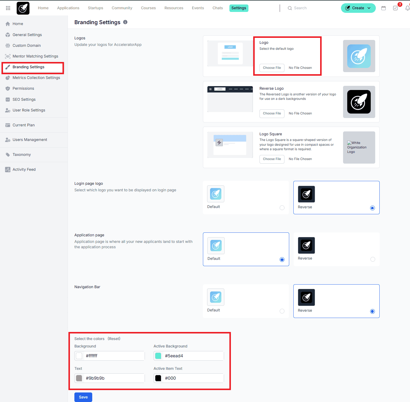
- Upload your logo to customize the login page, application page, and side menu
- Adjust colors, including background, links (active and inactive), and parent menu items
- Strengthen your brand identity across the platform Additionally, you can customize your URL using a subdomain (e.g., example.acceleratorapp.co). Note: Full white-label domains may incur an additional fee.
Where to find Branding Settings
All visual customization tools are centralized in the General Settings through Branding Settings.
Step-by-Step
To ensure your brand looks perfect in every corner of the app, you should upload specific versions of your logo:
Main Logo:
Your standard horizontal or primary logo.
Reverse Logo:
This is the version used for Dark Mode or on dark backgrounds. Usually, this is a white or light-colored version of your logo to ensure visibility.
Logo Square:
A 1:1 ratio version of your logo (often just an icon or monogram). This is designed for compact spaces like browser favicons.
Specific Page Logos:
Login Page Logo: Greets users as they enter.
Application Page Logo: Appears on external-facing application forms.
Navigation Bar Logo: Stays fixed at the top-left while users navigate the platform.
Setting Your Color Palette
Once your logos are uploaded, define the colors for your interface:
Background: The primary canvas color of your platform.
Active Background: The highlight color used when a user hovers over a menu or selects an item.
Text: The default color for all primary headings and paragraphs.
Active Item Text: The color of the text when a specific menu item is currently selected (helps with user orientation).
Click Save: Always hit Save at the bottom of the page to push these changes live to all users.
Best Practices
The Power of "Reverse": If your primary logo is dark blue, it will "disappear" if you set your Navigation Bar to a dark theme. Always upload a Reverse Logo (white/transparent) so the system can automatically switch between Light and Dark modes without losing brand visibility.
Square Logo Clarity: Avoid using small text in your Logo Square. Since it appears in tiny, compact spaces, stick to your brand's "Icon" or "Mark" for the best visual impact.
Accessibility First: When choosing your Text and Background colors, ensure there is high contrast. If the colors are too similar (e.g., light gray text on a white background), your users may struggle to read the documentation or application forms.